CASE STUDY
UX Laws for Better Design Decisions
How I helped designers and stakeholders create a shared language for evaluating design decisions.
Overview
I introduced UX Laws .as a shared decision-making framework during the Fast App redesign. The goal was to help designers and stakeholders evaluate design decisions with clearer rationale, reduce subjective debate, and create stronger alignment across Product, Engineering, Content, UX Research, and business teams.
The Challenge
The Fast App redesign involved multiple teams, competing priorities, and frequent questions about why specific design changes were needed.
The original experience had three main issues:
Redundant and inconsistent UI
High mobile friction and error rates
Limited shared understanding of design rationale
Stakeholders often challenged visual updates without a shared framework for evaluating usability, hierarchy, cognitive load, or interaction patterns. The team needed a common language for discussing design quality.

What I changed
Introduced UX Laws as shared language
I introduced UX Laws to help teams evaluate design decisions based on evidence-based principles rather than personal preference. This helped shift feedback from “I don’t like this” to more useful conversations about usability, clarity, effort, and cognitive load.
Ran Cross-functional learning sessions
I helped organize UX Laws sessions with designers, Product Owners, Business Analysts, Developers, Content, and UX Research. Each group explored a principle, connected it to a real product example, and discussed how it could improve the Fast App experience.
Embedded principles into design reviews
Design critiques and stakeholder reviews started referencing specific UX principles to explain decisions around hierarchy, calls to action, form design, mobile usability, and progressive disclosure.
Added UX laws into design artifacts
We incorporated UX Laws into briefs, Figma annotations, design rationale, and handoff conversations so the framework became part of everyday delivery rather than a one-time workshop.
UX Laws in practice
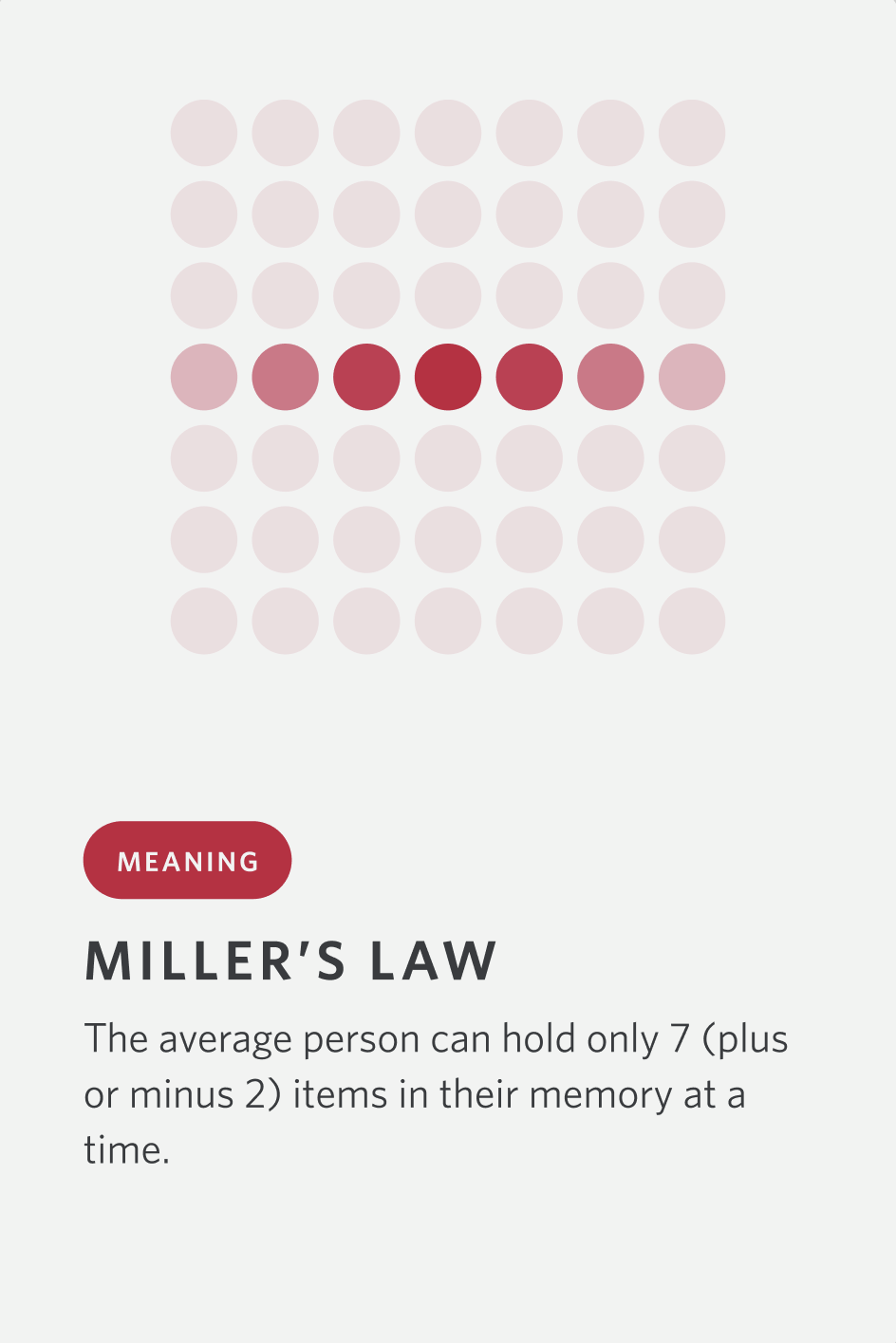
MIller’s Law
People can only process a limited amount of information at once.Application: Grouped related form fields and content into smaller sections to make dense information easier to process.
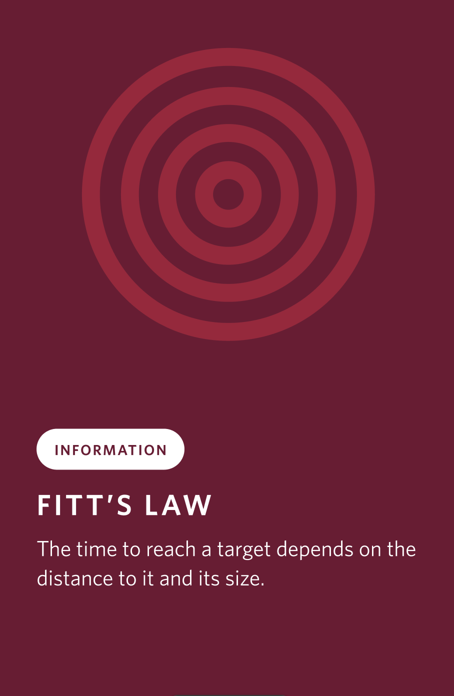
Fitt’s Law
The time to acquire a target is a function of the distance to and
size of the target.
Application: We enlarged primary CTA buttons and placed them in easily reachable thumb zones for mobile users.
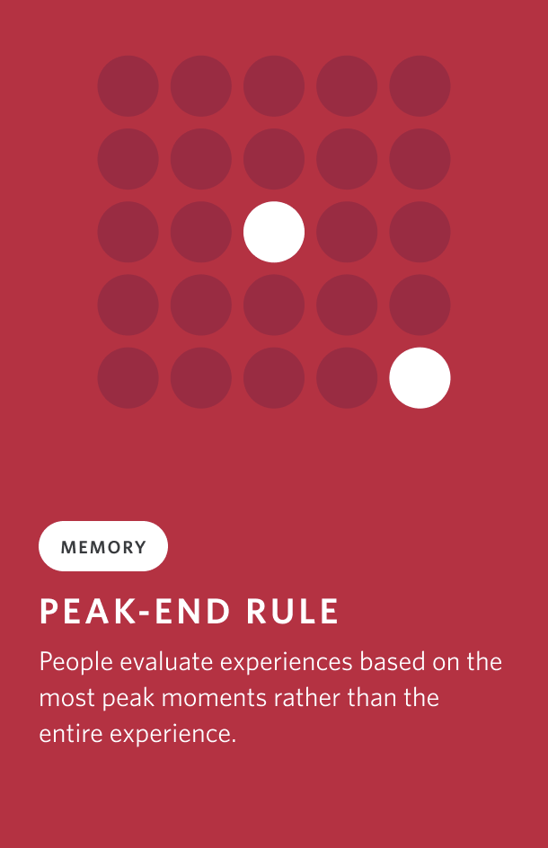
Peak End Rule
People judge an experience largely
based on how they felt at its peak and at its end, rather than the average of every moment.
Application: Surfaced help and guidance only when needed to avoid overwhelming users up front.
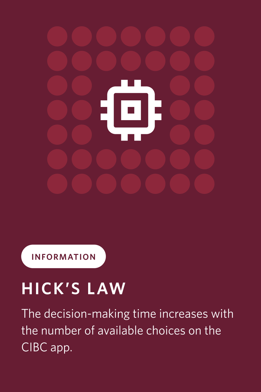
Hick’s Law
Improved mobile CTA placement and tap targets so key actions were easier to reach.Application: Improved mobile CTA placement and tap targets so key actions were easier to reach.
Impact
Team Alignment
Product, Design, Engineering, Content, and UX Research had a clearer shared language for discussing design decisions.
Faster Stakeholder Conversations
Reviews became less subjective because the team could evaluate work against shared principles rather than personal preference.
Stronger Design Rationale
Designers were better able to explain why changes mattered, using principles tied to usability, cognitive load, hierarchy, and user behaviour.
Better Delivery Foundation
UX Laws became part of briefs, critiques, Figma annotations, and design documentation, helping scale the approach beyond one redesign.

Takeaways
The biggest lesson was that design principles are most useful when they become part of how a team works. UX Laws helped create a shared language, but the real value came from using that language in critiques, stakeholder conversations, documentation, and delivery decisions.
This work showed that design leadership is not only about creating better screens. It is also about improving how teams make decisions together