CASE STUDY
CIBC Fast App Redesign
Simplifying account opening to increase conversion and speed
Project Overview
CIBC’s Fast App is a digital account-opening experience used by customers to apply for new banking products across desktop, tablet, and mobile. As the experience evolved, the team needed to reduce friction, modernize the interface, improve mobile usability, and align the work to CIBC’s broader design system.
I led product design for the redesign and modernization of Fast App, partnering with Product, Engineering, UX Research, Content, Strategy, and business stakeholders to improve the customer journey and support acquisition goals.
The Problem
The account-opening journey had become harder to use and scale, with dense forms, inconsistent patterns, unclear guidance, and mobile friction.
Teams needed stronger alignment to move beyond isolated screen fixes and simplify the experience for future growth.
Goals
Reduce form errors and customer confusion
Improve mobile usability across high-traffic acquisition flows
Align the experience to CIBC’s True North design system so future work could scale more consistently
Responsibilities
Led design direction for Fast App modernization and account-opening improvements
Partnered with Product and Strategy on roadmap planning, prioritization, and design discovery
Facilitated cross-functional workshops and introduced UX Laws to create stronger alignment around design decisions
Supported delivery through True North design system adoption, prototypes, research validation, QA reviews, and designer coaching
My Role
Led design direction for Fast App modernization and account-opening improvements
Partnered with Product and Strategy on roadmap planning and prioritization
Facilitated cross-functional workshops with Product, Engineering, Content, UX Research, Marketing, and business stakeholders
Supported design system adoption through CIBC’s True North system, design briefs, prototypes, and handoff documentation
Coached designers and improved design quality through UX Laws sessions, research validation, QA reviews, and clearer design rationale
Design Approach
Built alignment before solutions
1
Before moving into screens, I focused on building trust and alignment across the team. Workshops, OKR alignment, and collaborative problem framing helped shift the conversation from isolated design requests to shared product outcomes.
Created a stronger discovery process
2
I introduced a repeatable discovery approach using stakeholder interviews, competitor reviews, heuristic analysis, journey mapping, and design briefs. This helped clarify the problem, success metrics, constraints, and user needs before design execution began.
Simplified the application process
3
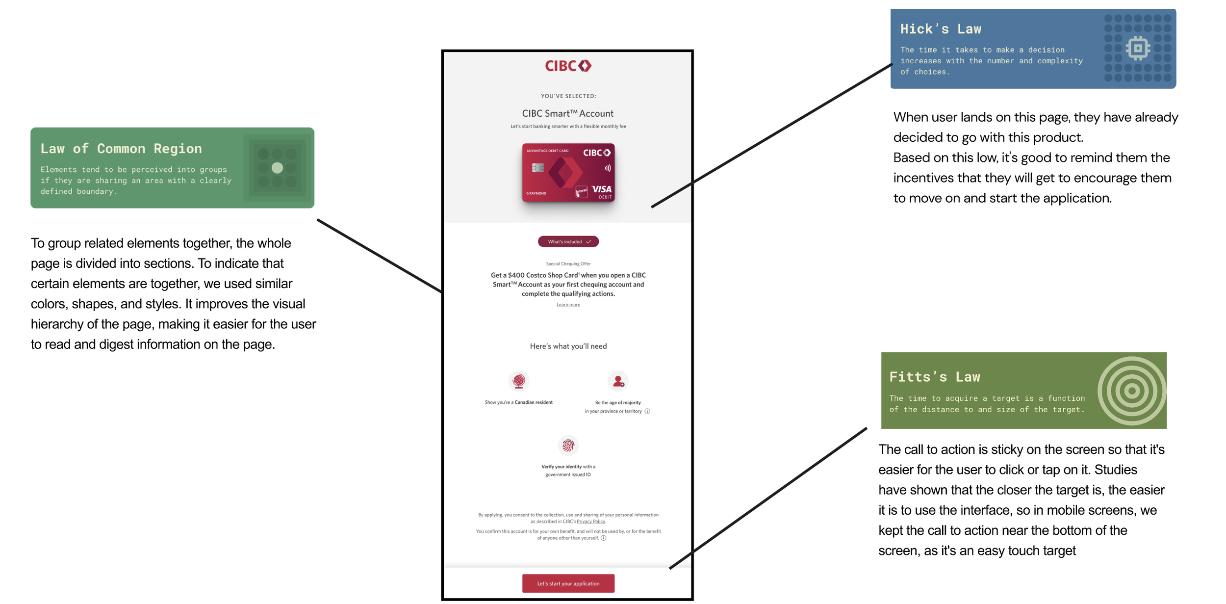
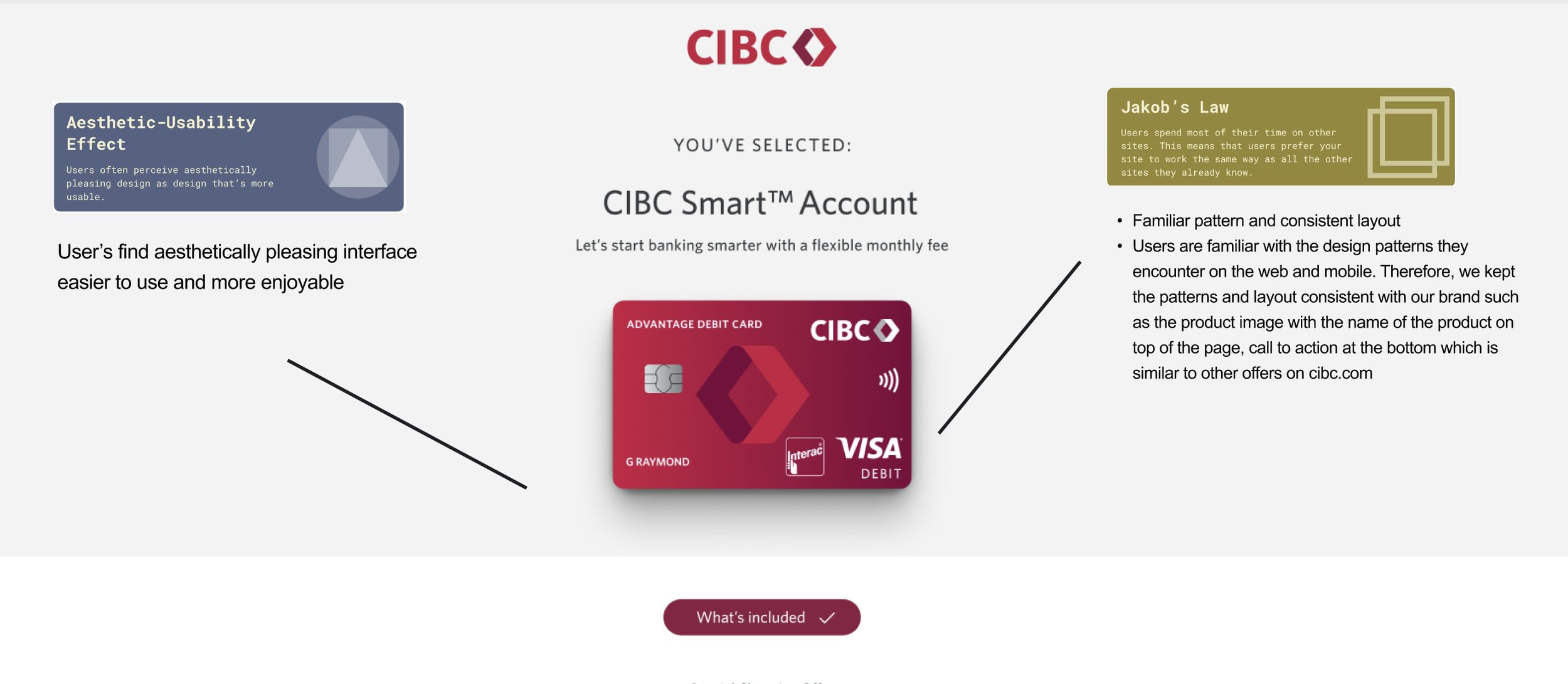
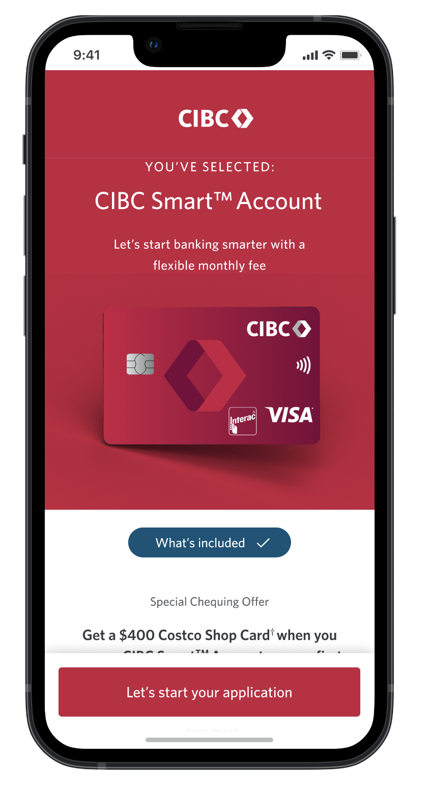
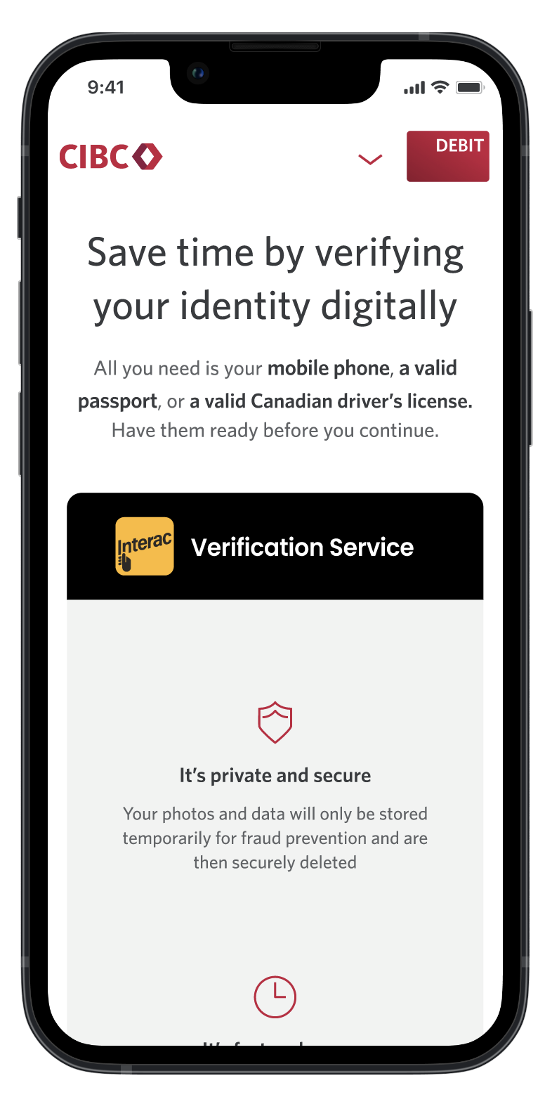
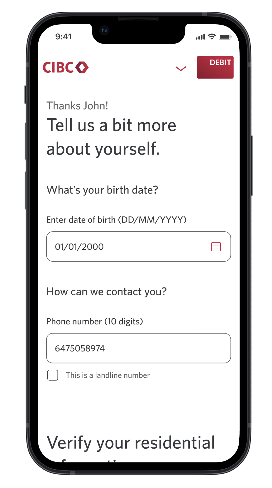
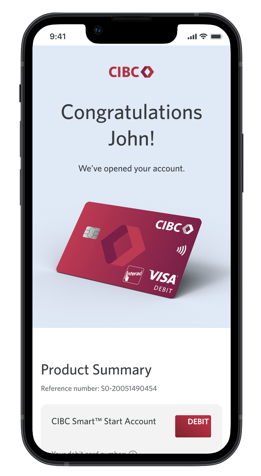
I redesigned key parts of the application to reduce cognitive load and make the experience easier to complete, especially on mobile. Updates included clearer hierarchy, grouped form fields, stronger progress cues, inline help, improved validation, and more focused content.
Improved decision making with UX principles
4
I introduced Laws of UX sessions to help teams evaluate design decisions through evidence-based principles instead of personal preference. This gave designers and stakeholders a shared language for usability, cognitive load, hierarchy, and interaction patterns.
Scaled quality through design systems
5
I helped migrate Fast App to CIBC’s True North design system to improve consistency, accessibility, reuse, and design-engineering alignment. This created a more scalable foundation for future account-opening work.
Refining the Design
Driven by passion, grounded by values. We're a team of passionate thinkers and doers, dedicated to building with purpose and clarity. Collaboration and curiosity drive everything we do.
The primary issues were that the application did not align to CIBC branding guidelines and was also not optimized for mobile view.
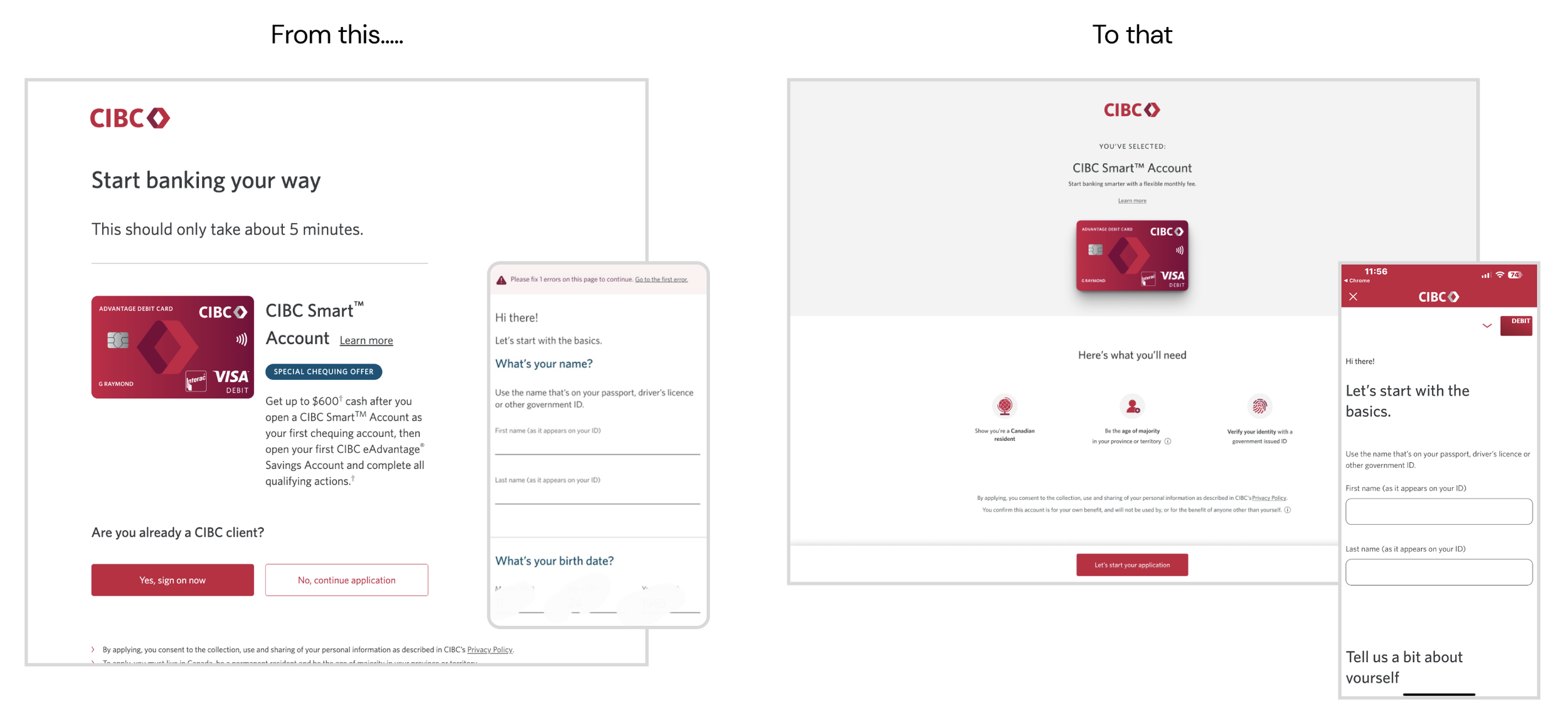
Final Design
Impact
2-Minute Reduction in Application
What it means: The average time for users to complete the Fast App digital application dropped from ~7 minutes to ~5 minutes.
Why it matters: Faster completion reflects reduced cognitive load and friction. This improves user satisfaction and reduces abandonment mid-flow, especially important on mobile where 65–70% of sessions occurred.
How it was achieved: Improvements in layout clarity, streamlined mobile form inputs, and clearer progress indicators helped users navigate with confidence and speed.
54% Error Reduction
What it means: The volume of critical form errors—such as incomplete required fields or improperly formatted inputs—was cut by more than half.
Why it matters: Fewer errors directly correlate with less user frustration, lower support call volume, and higher trust in the digital experience.
How it was achieved: Clearer field labels, validation cues, inline assistance, and better grouping of related information played a key role in reducing error with confidence and speed.
3% Overall Conversion Increase
What it means: More users who started the application process successfully completed it, representing a meaningful lift in net new account opens.
Why it matters: This directly contributes to business revenue growth, supporting acquisition KPIs and marketing spend ROI.
How it was achieved: Confidence-building content, better incentive messaging, consistent CIBC branding, and removal of redundant or confusing steps helped increase user follow-through.